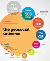
Are you a MOOC candidate?

Informed visually by infographics...We love MOOCs. Using a Massive Open Online Course allows you to log-in from anywhere in the world and take part in some of the best tutorial and learning opportunities available from major centres of excellence.

The Knight Centre for Journalism, at the University of Texas in Austin, U.S. is launching a six week course in January 2013 to foster a better understanding of Infographics.

Although primarily targeted at journalists, the course would enable anyone with an interest in project management, social research, evaluative assessment or needs analysis to develop skills in the area of making data more visually compelling.

Ideal for improving reports to funders, clients or helping to pitch that ‘argument’ for your upcoming project.

You can find out more about this on-line course and how to register on the Knight Centre web pages here.

For a very modest fee, over and above the free participation in the course, your can also get a certificate…mapping your Continuous Professional development trajectory?

If you do, the best of luck with your web participation.

(Image: Creative Commons 
Jess3, geo-social networks visualised)

Web-based Analysis
and Visualisation Environment

Weave - data analysis tools...


Weave is a new web based tool for use by novices and experts alike, to develop analysis and to visualise the results in a clear and informative way.

Weave has been developed at the Institute for Visualization and Perception Research of the University of Massachusetts Lowell in partnership with the Open Indicators Consortium, a fifteen member national collaborative of public and nonprofit organizations working to improve access to more and higher quality data.

As part of our ongoing list of resources to help develop understanding of and access to the tools for better data analysis, Weave is a perfect candidate.

Free and Open Source, with levels of interaction that can suit those simply exploring the techniques of data analysis and visualisation – Weave should be a go to tool for young people in the UK, wishing to explore or develop their skills in data analysis.

With the impending curriculum changes in the UK, and the governments revitalised commitment to Open Source software, Weave should be part of the new ICT landscape for young people, we would argue.

You can see a great example of the software in use delivering an analysis of the recent UK election here. ( A great U.S. view of our electoral system…).

You can see more about this software, and download it, from the Weave Wiki pages here.  To see the software deployed and to interact with the data use this example page here.

You can reach the Collected Works home page here.

A picture, a crowd,
a forest of data!

We were recently thinking about the outputs of our projects and the types of document, web site or data CD we needed to compile for our client evaluations, research reports, market analysis or evidence based recommendations.

Basic principles of number analysis were reasonably clear to frame verbally, but what about visual design in terms of  improving understanding for our clients. The dreaded phrase ‘…let’s do an info-graphic’  heaved itself over the horizon.

Blanching, we pressed ahead with trying to lay out some basic principles of how the data should not only be interpreted, but stylised and presented for consumption appropriate to the intended audience.

Never keen to re-invent the electric light all over again, in our research we came across a great  Speaker Deck  presentation which beautifully enunciated our thinking around how to present data in interesting and clear ways. (Great work by the author – zakiwarfel )

You can see the presentation on our data design page on the Collected Works main web site here. The author has laid out our forthcoming design template thinking perfectly. If we can use our principles to present your data, just let us know here.

Speaker Deck is a free pdf conversion app from Github – you can see more here