Web-based Analysis
and Visualisation Environment

Weave - data analysis tools...


Weave is a new web based tool for use by novices and experts alike, to develop analysis and to visualise the results in a clear and informative way.

Weave has been developed at the Institute for Visualization and Perception Research of the University of Massachusetts Lowell in partnership with the Open Indicators Consortium, a fifteen member national collaborative of public and nonprofit organizations working to improve access to more and higher quality data.

As part of our ongoing list of resources to help develop understanding of and access to the tools for better data analysis, Weave is a perfect candidate.

Free and Open Source, with levels of interaction that can suit those simply exploring the techniques of data analysis and visualisation – Weave should be a go to tool for young people in the UK, wishing to explore or develop their skills in data analysis.

With the impending curriculum changes in the UK, and the governments revitalised commitment to Open Source software, Weave should be part of the new ICT landscape for young people, we would argue.

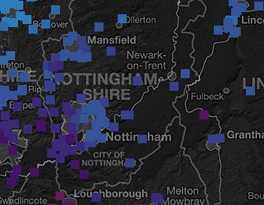
You can see a great example of the software in use delivering an analysis of the recent UK election here. ( A great U.S. view of our electoral system…).

You can see more about this software, and download it, from the Weave Wiki pages here.  To see the software deployed and to interact with the data use this example page here.

You can reach the Collected Works home page here.

The Higgs Boson?

Sometimes you just have to wander off theme with your blog entries.

Much has been written about the mysterious Higgs Boson particle in all the media lately. What is it? Where did it come from? Whither goest it?

This short film, in cartoon style, is from the University of California. (See credits below). It seeks to tell you the answer to some of the above questions.

Whether you have an abiding interest in science or not, knowing what gives you mass can definitely be defined as new knowledge.

For more videos and comics by Jorge Cham and Daniel Whiteson, visit www.phdcomics.com/higgs

This video made with the support of the University of California at Irvine.

www.phdcomics.com

You can find the Collected Works home page here…

Data, geography and human development – get spaced

spacePic2Kings College London, under the auspices of Professor Robert Plomin, Director of the Twins Early Development Study, has been compiling and analysing data and spatial information about the development of twins.

TEDS, as a programme, has sought to understand why young people, from the same family environment grow to be different. The nature or nurture argument.

The research team have recently published their findings, in map form, on this web page. You can use the software to interrogate and adjust the study variables to see the effects.

The project maps complex study data across geographical spaces. Additionally the team have also made the software Open Source. You can download the package, with examples, for Windows, Mac or Linux environments by visiting the TEDS web pages here.

There is a short explanatory video to illustrate the research and the teams findings too.

Full instructions and licensing information is included with the free software download here as well.

Different, but the same perhaps – whichever community you focus upon.

Project management
– thinking systems

boxB-WpicProject in a Box have recently revised and updated their Community Edition of the software that lets you get into Prince 2 mode for managing your projects.

Free to download and use for your single project manager activity, or with a team, PIAB is an ideal way to get even the most basic, simple project properly organised and presented to colleagues or boards of management in an orderly, structured and clear way.

We like it as a product, not only for its lack of cost, but because it is now .net portable – you can copy it to your usb stick and go anywhere, but also because the software now has PIAB Planner software feely available with it too.

If you want to manage your risk register, look after and track issues or to export outputs for others to work on, we think Planner is an invaluable additional tool to your ‘structured thinking’ armoury.

Ckeck out the Community Edition of Project in a Box here, you’ll be on your way to Prince 2 Practitioner status in no time.

Collected Works – offering information about CPD and free resources for socially supportive projects.

A picture, a crowd,
a forest of data!

We were recently thinking about the outputs of our projects and the types of document, web site or data CD we needed to compile for our client evaluations, research reports, market analysis or evidence based recommendations.

Basic principles of number analysis were reasonably clear to frame verbally, but what about visual design in terms of  improving understanding for our clients. The dreaded phrase ‘…let’s do an info-graphic’  heaved itself over the horizon.

Blanching, we pressed ahead with trying to lay out some basic principles of how the data should not only be interpreted, but stylised and presented for consumption appropriate to the intended audience.

Never keen to re-invent the electric light all over again, in our research we came across a great  Speaker Deck  presentation which beautifully enunciated our thinking around how to present data in interesting and clear ways. (Great work by the author – zakiwarfel )

You can see the presentation on our data design page on the Collected Works main web site here. The author has laid out our forthcoming design template thinking perfectly. If we can use our principles to present your data, just let us know here.

Speaker Deck is a free pdf conversion app from Github – you can see more here

Crunching numbers!

Across our two organisations we crunch a lot of data and format, style and produce thousands of words and images for paper and web publication.

We are always keen to utilise powerful, cost effective tools to produce trends, analysis and short data-sets that tell a story and illustrate the evidence of our findings.

Free, open source and powerful software like R. For statisticians and analysts R offers a number of useful tools, analytical and calibrational functions to produce real clarity from long range data sets.

You can discover R on this website.

Rob J Hyndman and George Athanasopoulos have produced an excellent online resource about the use of trends and forecasting. It also contains some handy hints about using the functions of R too. See more here of the Hyndman and Athanasopoulos online book here

These are great, free resources. Another alternative to getting abstracts of your long range data sets, or clear analysis of research findings, with press or web ready graphics to go with it – is to contact Collected Works.

Let us do the heavy lifting.